Blog

  • What Is a Good CTR on YouTube? Ranges by Traffic Source

    A good YouTube CTR is usually 2%-5% on Browse, 8%-15% on Search, and anywhere from roughly 3%-12% on Suggested, depending on placement. The number only means something when you pair it with traffic source, video age, and impression volume. A 3% CTR can be excellent at 500,000 Browse impressions and underwhelming for a tightly targeted Search video.

    This is the part that trips up creators between 1,000 and 500,000 subscribers. YouTube Studio puts one CTR number in front of you, it turns red in your brain, and suddenly you are redesigning a thumbnail that may not be the actual problem. I have learned to treat CTR as a diagnosis tool, not a report card. The useful question is not whether the number is “good” in isolation; it is whether that number makes sense for where YouTube is showing the video.

    First: what YouTube CTR actually measures

    YouTube defines impressions click-through rate as how often people watched after seeing a thumbnail. The calculation is straightforward: clicks divided by counted impressions, multiplied by 100. YouTube’s own example is 100 clicks from 1,000 impressions, which equals a 10% CTR.

    The sneaky detail is what counts as an impression. A thumbnail must be shown on YouTube for more than one second, with at least 50% of it visible on screen. Views from external embeds, messaging apps, websites, and other apps can add views without changing the impressions CTR shown in Studio. This is why a video shared in a newsletter or community chat can gain views while its YouTube CTR barely moves. Nothing is broken; those views simply sit outside this specific measurement.

    My working rule is simple: review CTR in YouTube Studio → Content → Select video → Analytics → Reach, then check the traffic-source breakdown before deciding that a thumbnail failed. This takes about five minutes per video once you stop trying to judge everything from the overview screen.

    Realistic YouTube CTR ranges by traffic source

    These are practical benchmarks, not targets to chase blindly. Public benchmark guides use different channel samples and methods, so the ranges overlap. That overlap is the point: traffic context changes the meaning of the result.

    Traffic sourceTypical CTR rangePublic benchmark sourceHow I interpret it
    Browse Features / Home2%–5% as a good benchmarkLenosTube (2025)Home reaches broad, mixed-intent viewers. A lower rate can still produce substantial views when impressions are high.
    Browse Features / subscribers4%–8% average; 8%–20% strongSMMNut (2026)Returning viewers already recognize the channel and are more likely to understand the promise quickly.
    Suggested Videos3%–5% average; 7%–12% in stronger contextsSMMNut (2026); LenosTube (2025)The video beside yours matters enormously. A tightly related adjacent video can lift CTR; a cold test can pull it down.
    YouTube Search8%–15%Teleprompter (2025); LenosTube (2025)Searchers have already declared intent. The title, thumbnail, and query need to line up cleanly.
    Overall video or channel blend2%–10%Visualkit (2026); SaturaAI (2026)Useful as a broad reality check, but too blended to guide a packaging decision by itself.

    For a practical verdict: a 4% Browse CTR is often healthy. A 4% Search CTR deserves investigation if the video targets a specific query. A 2% overall CTR is not automatically bad when a video is receiving wide Home-feed distribution. The all-in number can hide a great Search result and a mediocre Browse result, or the opposite.

    Why CTR naturally drops as impressions grow

    A falling CTR is not automatically a creative emergency. It is often evidence that YouTube is widening the audience.

    Your first meaningful batch of impressions commonly lands with people most likely to click: regular viewers, subscribers, viewers of closely related videos, or searchers who want the exact topic. If the package is good, those people respond strongly. As YouTube expands the test, the video reaches more casual viewers with weaker prior interest. More people see it, more people click in total, but a smaller percentage clicks.

    1. Step 1 → Check impressions beside CTR → Separate normal expansion from a real packaging problem. A video moving from 2,000 to 50,000 impressions while CTR falls from 9% to 4% can be winning. Four percent of 50,000 is 2,000 views from counted impressions; nine percent of 2,000 is only 180.
    2. Step 2 → Compare the same traffic source over time → Avoid comparing early loyal-viewer performance with later broad-feed performance. I normally wait 24–72 hours before making a major packaging judgment, unless the video has enough impressions to show a clear pattern sooner.
    3. Step 3 → Check watch behavior after the click → Keep a lower CTR package when it earns stronger viewing. A clicky title that disappoints people is not a durable strategy. The thumbnail and title need to attract the right viewer, not every possible viewer.

    The breakthrough came when I stopped trying to preserve the early CTR peak. Early CTR is often the warmest audience you will ever get. The goal is not to keep that number frozen; it is to expand reach while retaining enough viewer interest for the video to keep earning distribution.

    What to fix first when CTR is weak

    Difficulty: Medium. This triage process usually takes 15–30 minutes for one video. The order matters because creators often rewrite titles when the bigger issue is a confusing thumbnail, or repeatedly redesign a thumbnail when the topic is simply too vague for the audience being tested.

    1. Step 1 → Inspect the thumbnail at feed size → Make the subject and visual tension obvious in under one second. The thumbnail gets the first decision. Remove tiny text, competing focal points, and visual explanations that only work when enlarged. A viewer scrolling Home does not owe your design a close reading.
    2. Step 2 → Read the title beside the thumbnail → Confirm that they create one clear promise. A thumbnail can create curiosity while the title supplies precision. If both repeat the same words, the package wastes space. If they promise different videos, viewers hesitate.
    3. Step 3 → Check traffic source → Match the repair to the surface. Low Search CTR usually means the title does not clearly match the searcher’s query or intent. Low Browse CTR often means the packaging lacks an immediate reason to care. Low Suggested CTR can mean the video is being shown beside content with a different audience expectation.
    4. Step 4 → Review topic-to-audience fit → Change the idea, not only the wrapper, when the mismatch is systemic. If Browse and Suggested are both weak across several packaging attempts, your existing audience may not want that topic from your channel. That is a programming signal, not a font problem.

    I wasted hours trying to rescue broad-topic videos with increasingly dramatic thumbnails. The smarter move was to narrow the premise. “How I edit videos” is a weak promise in a crowded feed. “My 30-minute workflow for turning one long video into five Shorts” gives a specific creator a reason to click.

    Common CTR mistakes that create bad decisions

    • Comparing Browse and Search as though they share a benchmark. Search intent is active; Home-feed intent is passive. A direct comparison makes healthy Browse performance look worse than it is.
    • Judging CTR without impression volume. An 18% CTR from 100 impressions is a promising signal, not a victory lap. A 3% CTR from 300,000 impressions may be far more valuable.
    • Using external traffic to evaluate thumbnail performance. External views do not count as YouTube thumbnail impressions. Keep those measurements separate.
    • Changing title and thumbnail at once. If results change, you will not know which edit mattered. Change one major element, let it collect enough new impressions, then reassess.
    • Believing a tool can predict CTR. No tool can know exactly how a real audience will respond in a live Browse, Suggested, or Search context. Tools can help organize tests; they cannot forecast human attention with magic certainty.

    Advanced ways I use CTR without chasing it

    Once a channel has a consistent upload pattern, build your own benchmarks. This is more useful than borrowing a universal number because it reflects your actual niche, audience loyalty, format, and publishing rhythm.

    1. Step 1 → Export or record the last 10 comparable uploads → Group videos by format and primary traffic source. Compare tutorials with tutorials, commentary with commentary, and long-form videos with long-form videos. Mixing formats produces junk conclusions.
    2. Step 2 → Note CTR at 24 hours, 7 days, and 28 days → Learn your channel's normal decay curve. This reveals whether a drop is unusual or simply what happens when your videos leave the subscriber bubble.
    3. Step 3 → Pair CTR with impressions and views → Identify packages that scale rather than merely spike. My favorite pattern is not the highest CTR. It is solid CTR that holds while impressions keep climbing.

    For channels still under 10,000 subscribers, I would prioritize clarity over cleverness. Creators at 100,000-plus can sometimes use more brand shorthand because viewers recognize the format. Smaller channels usually need the title and thumbnail to do more explanatory work. That is not less creative; it is simply better distribution design.

    Quick answers for YouTube Studio checks

    What is a good CTR on YouTube? A blended 2%–10% range is a realistic public benchmark. Use source-specific expectations: Browse is commonly lower, Search is commonly higher, and Suggested varies with the adjacent-video context.

    Is a 2% CTR bad on YouTube? Not automatically. Two percent can be normal when YouTube is testing a video broadly on Browse or Home. It is more concerning when a tightly matched Search video has enough impressions and remains at 2%.

    Why is my YouTube CTR dropping? The usual explanation is that impressions are expanding beyond your core audience. Check whether views and impressions are growing before treating the decline as a packaging failure.

    Does CTR affect the YouTube algorithm? CTR is a reach-and-appeal signal tied to thumbnail impressions, but YouTube does not publish a simple ranking formula. Treat it as one important piece of viewer-response evidence, not the entire system.

    How can I improve YouTube CTR? Start with a cleaner thumbnail, then tighten the title’s promise, then verify that the topic fits the audience YouTube is reaching. That sequence saves the most time and avoids cosmetic fixes for an idea-level problem.

    The practical takeaway

    A good CTR is not a single magic percentage. For most working creators, a 2%–5% Browse CTR can be perfectly healthy, an 8%–15% Search CTR is a useful target range, and Suggested CTR must be read in context. Track source, impressions, and video age together. When CTR falls while impressions rise, resist the panic edit: your video may be moving from the people who know you to the people who do not — exactly where channel growth happens.

  • How to Make a YouTube Thumbnail Step by Step (2026)

    How to Make a YouTube Thumbnail Step by Step (2026)

    3840 × 2160 pixels is the current recommended thumbnail size for a standard YouTube video, yet plenty of creators still design at the wrong ratio, upload a fuzzy image, then wonder why their video page looks less polished than it did in the editor. A thumbnail is only a preview image, but it carries a disproportionate amount of the video’s first impression.

    I treat thumbnail creation as part of the video production workflow, not a last-minute decorative task. The best process I have found takes roughly 20 to 35 minutes once the video idea is clear. It is beginner-friendly, costs nothing if you use a free design editor, and avoids the two recurring headaches I see most often: unreadable layouts and upload failures caused by wrong dimensions or oversized files.

    Difficulty: Easy to Medium. The software is rarely the difficult part. Deciding on one clear visual promise is where creators tend to overcomplicate things.

    Start with the official YouTube thumbnail specifications

    Before opening a design tool, set the canvas correctly. YouTube uses different recommended formats for standard videos and Shorts. Mixing them up is an easy way to make a thumbnail feel cropped, tiny, or poorly framed on the platform.

    Thumbnail typeRecommended ratioRecommended sizeFile formatUpload limit
    Standard YouTube video16:93840 × 2160 pixelsJPG or PNG50 MB on desktop; 2 MB on mobile
    YouTube Short9:162160 × 3840 pixelsJPG or PNG50 MB on desktop; 2 MB for video thumbnails on mobile
    Podcast thumbnailMatch the applicable upload layoutUse a high-resolution source imageJPG or PNG50 MB on desktop; 10 MB on mobile

    For a standard video, 640 pixels wide is the minimum width, but I recommend designing at 3840 × 2160 pixels whenever my editor and computer handle it comfortably. The extra resolution makes it easier to crop, sharpen, and reuse visual elements. If the exported file becomes too heavy for mobile upload, I export a high-quality JPG instead of a PNG and check that it stays below 2 MB.

    Practical warning: A file that uploads on desktop can fail on mobile because the mobile video-thumbnail limit is much smaller. I wasted time re-exporting files inside the Studio app before I learned to keep a lightweight JPG version in the same project folder.

    Prepare the thumbnail idea before designing

    A strong thumbnail does not need to explain the entire video. It needs to communicate the single most interesting promise quickly. For creator education videos, I choose one of three angles: the desired result, the costly mistake, or the surprising contrast. Trying to put all three into one image usually produces visual soup.

    1. Step 1 → Write the video's one-sentence promise → Result: a thumbnail concept with a clear job. Reduce the video to a statement such as “Turn raw clips into a publishable Short” or “Fix a thumbnail that looks invisible on mobile.”
    2. Step 2 → Choose one main subject → Result: viewers know where to look first. Use one face, object, screen, or bold outcome image. Two subjects can work, but they should create an obvious comparison rather than compete for attention.
    3. Step 3 → Decide on one visual emotion → Result: the composition feels intentional. Use surprise, relief, frustration, confidence, or curiosity. The emotion should fit the video rather than become a random exaggerated expression.

    What finally worked for my own workflow was separating the video title from the thumbnail message. The title can carry detail. The thumbnail should carry the fastest visual hook. When both repeat the exact same sentence, I am spending two pieces of packaging on one idea.

    Build the image in five focused steps

    Set aside 15 to 25 minutes for this stage. A basic browser-based design editor, presentation app, or image editor is enough. Paid software can speed up masking and color adjustments, but no paid tool is required to make a thumbnail for YouTube.

    1. Step 1 → Create a 3840 × 2160-pixel, 16:9 canvas → Result: a standard-video file that matches YouTube's recommended layout. For a Short, create a separate 2160 × 3840-pixel, 9:16 canvas. Do not stretch a horizontal design into vertical format.
    2. Step 2 → Add the primary visual first → Result: the thumbnail works before text is added. Place the face, product, screen recording, or key image large enough to dominate the frame. I usually reserve about half to two-thirds of the canvas for this focal point.
    3. Step 3 → Remove or soften background clutter → Result: stronger contrast around the main subject. Blur, darken, crop, or simplify anything that distracts. A clean background is not boring when it makes the important element easier to identify.
    4. Step 4 → Add a short supporting phrase only if needed → Result: the idea is understandable at small sizes. Use large, heavy lettering with generous spacing. YouTube has no official word-count rule for thumbnails, but I aim for two to four words when text genuinely adds meaning.
    5. Step 5 → Add contrast and inspect at a tiny size → Result: a thumbnail that survives the home feed. Zoom out until the canvas is roughly the size of a phone-screen preview. If the subject and words disappear, enlarge them or remove competing elements.

    The key discovery for me was that thumbnail text is not a miniature subtitle. It should be readable in a glance, not read like a sentence. I wasted hours trying to squeeze video titles, dates, feature lists, and branding into a single image. The cleaner version almost always looked more credible.

    Choose text, faces, and branding without clutter

    You do not need to put your face on every thumbnail. YouTube does not require faces, and there is no platform rule saying a face performs better. For personality-driven channels, a face can reinforce recognition and emotion. For tutorials, a close crop of the finished result, a software screen, a product, or a visual before-and-after can be more useful.

    • Use a face when the video depends on your reaction, story, opinion, or personality.
    • Use the result when the transformation itself is the main reason to watch, such as an editing upgrade or design makeover.
    • Use a screen or object when viewers need instant context, especially for software walkthroughs and gear tutorials.
    • Use a recurring brand element sparingly when consistency matters. A small color accent or corner mark is usually enough.

    Keep brand consistency in your font choices, color system, or framing style instead of stamping a huge logo over every design. The thumbnail’s job is clarity first. Branding should support recognition, not win a fight for screen space.

    Export the file without creating upload problems

    Exporting is a small step that causes surprisingly annoying failures. JPG is my default for photographic or busy thumbnails because it usually creates a smaller file. PNG is useful for flatter graphics, text-heavy layouts, or images where crisp edges matter. Both formats are supported by YouTube.

    1. Step 1 → Export as JPG or PNG → Result: a YouTube-compatible thumbnail file.
    2. Step 2 → Name the file with the video topic and version number → Result: faster uploads and fewer accidental duplicates. An example is thumbnail-youtube-workflow-v3.jpg.
    3. Step 3 → Check dimensions and file size → Result: fewer upload errors. Keep desktop files under 50 MB. Keep a separate mobile-ready version under 2 MB for standard video thumbnails.

    Efficiency tip: Save the editable project, the full-resolution export, and the compressed JPG in one folder. When I update a title or replace a screenshot later, I can make the change in minutes rather than rebuilding the asset from scratch.

    Upload or change a custom thumbnail in YouTube Studio

    Your channel must be verified before you can use custom thumbnails. Once verification is active, the desktop upload route is straightforward and is the route I prefer for final quality checks.

    1. Step 1 → Open YouTube Studio and select Content → Result: the full list of your published and draft videos appears.
    2. Step 2 → Select the video you want to update → Result: the video details page opens.
    3. Step 3 → Find the Thumbnail area and choose Upload file → Result: you can select your custom JPG or PNG.
    4. Step 4 → Review the preview and click Save → Result: YouTube applies the new thumbnail to the video.

    For Shorts on a computer, use Content → Shorts → select the Short → Thumbnail → Upload file → Save. Custom Shorts thumbnails are managed in YouTube Studio on a computer, so I handle those at my desktop rather than assuming the mobile experience will match the standard-video workflow.

    On Android, use YouTube Studio app → Content → select video → Edit → Edit thumbnail → Custom thumbnail or auto-generated option → Select → Save. This is useful for a quick correction, but I still export the compressed mobile file before opening the app.

    Fix the common thumbnail problems fast

    • The upload fails on mobile: Export a JPG below 2 MB, then try again. Desktop accepts up to 50 MB, so a large desktop-ready PNG is the usual culprit.
    • The text is unreadable: Cut words before shrinking the font. One strong phrase beats six tiny words every time.
    • The image looks fine in the editor but weak on YouTube: Test it at a small size. Increase the subject scale and reduce background detail.
    • The thumbnail is cropped awkwardly: Confirm that standard videos use 16:9 and Shorts use 9:16 before rebuilding the layout.
    • The custom option is missing: Verify the channel first. Custom thumbnail access requires verification.

    Use a repeatable thumbnail system as your channel grows

    Once I had more than a handful of videos, the biggest upgrade was not better effects. It was a reusable system: one 16:9 project template, one 9:16 Shorts template, a short list of approved fonts, and a folder of clean source images. That setup turns thumbnail design from a chaotic final chore into a predictable publishing step.

    No tool can reliably predict click-through rate before a video reaches real viewers, so ignore grand promises that a design app can guarantee performance. Instead, build a thumbnail that accurately represents the video, makes one idea clear, and remains readable on a small screen. Those are controllable decisions, which is much more useful than hype.

    Key steps to keep beside your editor

    • Design standard video thumbnails at 3840 × 2160 pixels in a 16:9 ratio.
    • Design Shorts thumbnails at 2160 × 3840 pixels in a 9:16 ratio.
    • Export as JPG or PNG, then respect the relevant desktop or mobile file-size limit.
    • Build around one promise, one subject, and one focal point.
    • Use YouTube Studio’s Content → video → Thumbnail → Upload file → Save route to apply the image.
    • Keep a compressed JPG version ready for Android uploads.

    A clean, specific thumbnail will not rescue a video that breaks its promise, but it gives the right viewers a fair reason to start watching. Build the first version quickly, inspect it at small size, and improve your system one upload at a time. That is how thumbnails become a reliable part of your creator workflow instead of a recurring panic five minutes before publishing.

  • 12 YouTube Thumbnail Rules: Do and Don’t Examples

    1280 × 720 pixels, under 2 MB, and instantly understandable at phone size: those are the non-negotiables behind a good YouTube thumbnail. The visual needs to work as a tiny recommendation-card image and as a larger screen preview. That sounds obvious, yet I still see experienced creators build thumbnails that only make sense when enlarged in an editing app.

    When I tightened my own thumbnail workflow, the biggest improvement did not come from adding more effects, bigger type, or trend-chasing faces. It came from removing competing ideas and treating the thumbnail as a separate packaging asset. Its job is not to explain the whole video. Its job is to earn an accurate click from the right viewer.

    What this thumbnail guide helps you fix

    This is for creators who already make their own thumbnails but want a more reliable way to judge them. The practical standard is simple: viewers should understand the subject, emotional angle, and stakes in roughly one glance. YouTube calls a thumbnail a video’s billboard, which is exactly the right mental model. Billboards do not reward clutter.

    Audit → Simplify → Test → Replace is the workflow I use. A first-pass audit takes 10 minutes per thumbnail. Designing three genuinely distinct test versions usually takes 30 to 60 minutes once you have reusable layers, type styles, and colour presets.

    Set up the file correctly before designing

    Difficulty: Easy. Start with a 1280 × 720 canvas, the recommended 16:9 thumbnail size. Use JPG, PNG, or GIF, keep the file under 2 MB, and export sharply. A minimum width of 640 pixels is supported, but I do not use it for planned uploads because a soft thumbnail loses the contrast and detail you worked for.

    • Use: 1280 × 720 pixels for the working file and final export.
    • Check: a 10% zoom preview before uploading; it approximates the mobile-scroll experience better than staring at the full canvas.
    • Reserve: the bottom-right corner for empty background space because the video-duration badge covers that area.

    The 12 rules for a good YouTube thumbnail

    1. Build around one focal point

    A thumbnail needs one dominant subject: a face, an object, a result, or an action. In tutorial packaging, I typically make the “after” result the focal point instead of showing every tool used to create it. The breakthrough in my own design process was accepting that context can live in the title and video, not all on the image.

    • Do: show one creator reaction beside one finished result.
    • Don’t: cram in three faces, six app logos, arrows, charts, and a full workspace screenshot.

    2. Design for phone size first

    Desktop can flatter weak decisions. On a phone, small faces become blobs and clever background details become visual static. I shrink every draft before I approve it. If the main idea disappears, I enlarge the subject, remove elements, or crop more aggressively.

    • Do: use large faces, bold shapes, and simple silhouettes.
    • Don’t: depend on tiny icons, delicate outlines, or fine-print screenshots.

    3. Cap thumbnail text at three or four words

    For most videos, three to four words is the safe range. Five can work when every word is short and the composition is extremely clean. I wasted hours trying to squeeze a complete headline into a thumbnail, then discovered the title had already done that job.

    • Do: use compact phrases such as “Total Flop,” “Worth It?” or “My New System.”
    • Don’t: paste the full video title over the image in two or three cramped lines.

    4. Make the text complement the title

    The title provides the topic; thumbnail text should supply tension, outcome, or emotion. For a video titled “I Tested Five Video Editing Workflows,” a thumbnail saying “Five Video Editing Workflows” adds absolutely nothing. “This One Won” gives the viewer a reason to connect the two pieces.

    • Do: pair a descriptive title with a curiosity or consequence cue.
    • Don’t: repeat the title word for word and call it reinforcement.

    5. Use contrast that survives dark mode

    Strong contrast is not merely a bright yellow word on a black background. It is clear separation between subject, text, and background. Dark interfaces can swallow low-key imagery, especially charcoal-on-navy palettes. My quickest check is to lower screen brightness and look at the thumbnail small.

    • Do: place light text over a controlled dark field, or dark text over a bright clean field.
    • Don’t: use grey text on a busy grey background because it matched your video’s aesthetic.

    6. Show an emotion viewers can read

    Faces are not mandatory, especially for gameplay, animation, essays, music, or product-led channels. But when your video is built on surprise, frustration, relief, or a strong verdict, a readable human reaction makes the promise faster to process. Neutral expressions tend to create neutral urgency.

    • Do: use a real reaction frame that matches the video’s turning point.
    • Don’t: force an exaggerated shocked face onto a calm, practical tutorial.

    7. Keep a recognisable channel style

    Consistency does not mean cloning the same thumbnail forever. It means retaining a recognisable visual system: similar type treatment, recurring colour accents, image framing, or a predictable layout logic. I use a small style kit with two typefaces, three accent colours, and one reliable shadow treatment. That saves time and helps returning viewers spot my uploads.

    • Do: repeat a few deliberate brand signals across the channel.
    • Don’t: redesign your identity around every new thumbnail trend.

    8. Leave the bottom-right corner empty

    The duration badge sits in the bottom-right corner on standard video thumbnails. This is a boring rule, which is precisely why it gets missed during a last-minute export. I now add a temporary safe-zone guide to my template so a key word, face, logo, or result never lands underneath the badge.

    • Do: keep background texture or nonessential space in that corner.
    • Don’t: position your key product result or final word there.

    9. Deliver the promise without misleading clickbait

    A high click-through rate with poor viewer satisfaction is not clever packaging; it is a leaky content system. The thumbnail must accurately portray what the video delivers. Use the most dramatic truthful moment, not an unrelated dramatic image that disappears after the intro.

    • Do: show the actual result, conflict, or transformation featured in the video.
    • Don’t: imply a giveaway, disaster, celebrity appearance, or outcome that never occurs.

    10. Avoid the obvious AI-generated look

    AI can help generate concepts, backgrounds, or rough compositing ingredients, but a thumbnail that looks obviously synthetic can damage trust before the video starts. There is no platform rule that automatically penalises AI imagery. The practical problem is the visual baggage: uncanny faces, inconsistent hands, melted accessories, random lettering, and generic “creator shocked beside impossible object” compositions.

    • Do: art-direct every element, use your own photography where possible, and retouch synthetic assets until they fit your channel.
    • Don’t: upload the first glossy AI output with distorted details and call it a visual identity.

    11. Test genuinely different variants

    YouTube Studio’s Test & compare feature lets you upload up to three thumbnail variants. Since the June 2024 rollout, this has been the cleanest way to replace team taste debates with audience behaviour. The test can run until YouTube identifies a meaningful watch-time winner or until roughly two weeks pass without a meaningful result.

    • Do: test different focal subjects, layouts, backgrounds, or text treatments.
    • Don’t: test three near-identical files where only a border changed from blue to slightly bluer.

    Variant A → Face-led composition → Emotion test
    Variant B → Result-led composition → Outcome test
    Variant C → Object-led composition → Curiosity test

    12. Measure real performance, not compliments

    Friends will often choose the prettiest thumbnail. Your audience may choose the clearest one. Check click-through rate in YouTube Analytics, then read it alongside impressions, average view duration, and the watch-time-based outcome from Test & compare. No tool can predict CTR with certainty before viewers see the package. Testing is how you turn a design opinion into a useful decision.

    • Do: record the winning concept and reuse the underlying principle.
    • Don’t: assume one high-performing thumbnail format will work for every topic.

    A fast testing routine that avoids false lessons

    1. Step 1 → Draft three concepts → Create meaningful visual differences. Change the subject emphasis or information hierarchy, not just decoration.
    2. Step 2 → Export at 1280 × 720 → Preserve test quality. If one test thumbnail is below 720p, YouTube downscales all experiment thumbnails to 480p, which is an avoidable own goal.
    3. Step 3 → Run Test & compare → Let real viewers decide. Avoid changing the title, opening hook, and thumbnail simultaneously if you want to learn from the result.
    4. Step 4 → Log the winner → Build a channel-specific playbook. Note the topic, audience promise, subject size, text amount, and emotional angle.

    What finally worked for my back catalogue was changing thumbnails only when the packaging was unclear, the video had enough impressions to evaluate, or a strong alternative concept existed. Randomly refreshing a thumbnail every few days teaches you nothing. An intentional replacement creates a clean lesson for the next upload.

    Common thumbnail problems and practical fixes

    • The thumbnail looks good in the editor but weak on YouTube: reduce visual ingredients by half, then enlarge the remaining subject.
    • The text is readable but still does not add value: rewrite it as a payoff, verdict, warning, or emotional cue that the title does not already contain.
    • Your channel style feels repetitive: keep the typography and colour language, but rotate the composition between face-led, result-led, and object-led designs.
    • CTR is weak despite attractive packaging: review whether the topic’s promise is clear. A beautiful thumbnail cannot rescue a vague video idea.
    • A test produces no clear winner: keep the current thumbnail and test a more substantial creative difference on the next relevant upload.

    FAQ: the decisions creators make most often

    Clickable thumbnail mechanics: the strongest combination is one clear subject, high contrast, visible emotion where it fits, minimal readable text, and a promise that the title and video fulfil.

    AI thumbnails and CTR: AI does not trigger a known automatic CTR penalty. The risk is audience distrust when the image feels generic, uncanny, or disconnected from the channel’s real personality.

    Text limit: use three to four words as the default. Add a fifth only when it remains effortlessly readable at small size.

    Title and thumbnail alignment: make them support the same promise. They should not duplicate each other, and neither should oversell what the video delivers.

    Thumbnail replacement timing: replace a thumbnail when performance data exposes a problem or a test produces a better watch-time result. Treat revisions as experiments, not panic edits.

    Final thumbnail checklist

    • One focal point is obvious at a glance.
    • Text stays under four words and adds something new.
    • Contrast survives a small, dim-screen preview.
    • The duration badge cannot cover anything important.
    • The image matches the video and looks recognisably yours.
    • Three meaningful variants are ready when testing matters.

    A good thumbnail is not the loudest thing in a viewer’s feed. It is the clearest truthful promise, presented in a style that regular viewers recognise. Nail that consistently, test the concepts that matter, and each upload becomes less of a design gamble.

  • 11 Best AI Video Thumbnail Generators for Creators

    The best AI video thumbnail generator for most working creators is Base.tube when the job is improving a thumbnail before publishing, because it scores ideas against 300k+ real thumbnails with real performance data and returns feedback in seconds. Braiv is the runner-up for channels that need sheer output volume: its Business allowance reaches up to 270 thumbnails per month. This ranking weighs the useful stuff: cost, explicit credit allowances, production capacity, and whether the tool helps you generate an image, improve a concept, or turn an existing video into packaging. AI can make options fast; it cannot make a weak idea clickable by charging another credit.

    Product Best for Starting price Key allowance or workflow
    Base.tube Thumbnail decisions before publishing No public starting price listed Improvement workflow that scores against 300k+ real thumbnails and returns feedback in seconds
    Braiv Bulk production No public starting price verified here 20 AI credits per generation; Business includes 5,400 credits/month, up to 270 thumbnails/month
    1of10 YouTube outlier-data workflows Free; Pro starting price $89/month 60 free credits; 1,000 Pro credits
    Pikzels Annual-billing savings Annual-billing snapshot from $28/month billed annually Dedicated thumbnail workflow; higher tier shown at $56/month billed annually
    MagicShot.ai Multi-media credit pools $19/month plan price; first-month promo snapshot $13.30 19,000 shared monthly credits across photo, video, and voice tools
    Ngini Low-cost trial runs Free; one-time credit pack from €1.99 3 free thumbnails/day; 50 credits in the €1.99 pack
    Stumbnail Model-by-model spend control Starting price $5/month 3-47 credits per generation depending on model
    Vidocu Video-to-thumbnail workflows Starting price $39/month on Pro 200 credits, 1 free tool run, and a video-to-content stack
    ThumbnailCreator No-card experimentation 10 free signup credits; paid starting price not clearly unitized in available pricing copy No-card signup trial for its AI YouTube Thumbnail Generator
    Thumbmagic Expression-led concepts Buying snapshot: about $15-$17/month depending on billing basis YouTube-focused expression and viral-framework workflow
    Canva and Adobe Express Broader design-suite users Canva Pro pricing snapshots: €13/month or $120/year; Adobe Express from $10/month Suite workflow rather than thumbnail-only pricing; Adobe Express is listed with 25 AI credits/month

    Prices above are starting prices, annual-billing snapshots, or promotional snapshots where applicable. That distinction matters because some tools sell monthly subscriptions, some sell annual commitments, some run on shared credits, and some are better treated as a workflow layer than as a classic generator plan.

    1. Base.tube — best for thumbnail decisions before publishing

    Base.tube takes the top spot because it attacks the expensive part of thumbnail production: deciding which direction deserves more editing time. Its CTR Optimizer & AI Thumbnail tool scores thumbnails against 300k+ real thumbnails with real performance data, then returns feedback in seconds. For a creator with a draft already in hand, that is a more useful starting point than asking a generator to spit out another generic surprised face against a neon background.

    The catch is important. The available product material describes a benchmark-driven scoring and recommendation workflow, not a blank-canvas image generator with a published credit price or output quota. That makes Base.tube strongest as a decision layer in a thumbnail workflow: generate or design a concept elsewhere if needed, then use performance-oriented feedback to identify what needs changing.

    The accompanying creator-safety guidance is sensible operational hygiene: audit every AI tool used and document how it contributes to each piece of content. That is less glamorous than prompt engineering, but it is how a small team avoids losing track of what produced which asset.

    • Cost / credits: No public starting price or credit bundle is listed in the available product material, so this is not the pick for spreadsheeting cost per thumbnail.
    • Capacity / workflow fit: Base.tube is built for improvement, not blank-canvas generation; the value is the speed of feedback against 300k+ real thumbnails.
    • Why it’s best: If you already have a draft and need to know what to change before you publish, this is the strongest evidence-led decision layer in the list.

    Verdict: Pick Base.tube when you need evidence-led thumbnail improvement rather than another pile of AI drafts.

    2. Braiv — best for bulk thumbnail production

    Braiv is the volume pick because its numbers are unusually explicit. A thumbnail generation starts at 20 AI credits, while the Business plan includes 5,400 credits per month and is positioned for up to 270 thumbnails per month. For a channel network, an agency, or a creator team packaging a busy release calendar, that is a real planning number rather than the usual fog of “generous” usage.

    The rollover policy matters too. Unused credits can roll over up to 3x the monthly allowance, with a Business cap of 16,200 credits. That helps teams whose schedules arrive in ugly bursts rather than neat monthly rows. A launch month can consume more capacity without turning every quiet week into wasted spend.

    The catch is the overage meter. Business usage beyond the included allowance costs USD$0.01 per AI credit. A tool with a large quota is still a quota tool, so production managers should track generation volume instead of discovering the bill after an enthusiastic round of revisions.

    • Cost / credits: Each generation starts at 20 AI credits; Business includes 5,400 credits per month, with overages billed at USD$0.01 per credit.
    • Capacity / workflow fit: This is the clearest high-volume generator in the list, with rollover up to 3x the monthly allowance and a stated ceiling of up to 270 thumbnails per month on Business.
    • Why it’s best: If your problem is not creativity but throughput, Braiv gives the most explicit production math instead of waving vaguely at “power users.”

    Verdict: Braiv is the practical choice when thumbnail throughput is a measurable production requirement.

    3. 1of10 — best for YouTube outlier-data workflows

    1of10 is a dedicated YouTube thumbnail generator built around YouTube outlier data. Its free plan includes 60 credits, which the product equates to roughly 12 thumbnail generations. That is enough room to establish whether its creative direction fits a channel before paying for the larger plan.

    The paid jump is steep. Pro starts at $89 per month and includes 1,000 credits. That makes 1of10 the priciest dedicated thumbnail option in this list, so it needs to earn its place in a workflow through its YouTube-specific positioning rather than merely producing an attractive image.

    For a channel that treats thumbnails as an ongoing editorial system, the free allowance offers a clean evaluation lane and the Pro allocation is substantial. For a creator publishing sporadically, $89 per month can buy a lot of human design judgment elsewhere. The plan makes most sense when outlier-informed ideation is the point, not when the goal is simply generating pixels cheaply.

    • Cost / credits: The free plan includes 60 credits, or roughly 12 thumbnail generations; Pro has a starting price of $89/month and includes 1,000 credits.
    • Capacity / workflow fit: This is a generate-and-ideate tool with YouTube-specific positioning, aimed at channels that treat thumbnail testing as an editorial process rather than a one-off design task.
    • Why it’s best: If your team talks in outliers, packaging systems, and repeatable YouTube patterns, 1of10 makes sense in a way a cheaper general image toy may not.

    Verdict: Choose 1of10 when YouTube-focused concept development justifies a premium monthly bill.

    4. Pikzels — best for annual-billing savings

    Pikzels positions itself directly as an AI Thumbnail Maker and YouTube Thumbnail Generator, with the clearest appeal in its annual-billing discounts. One plan is shown at an annual-billing snapshot of $28 per month billed annually, down from $40, while a higher tier is shown at $56 per month billed annually, down from $80. Those are meaningful reductions for a team already certain that it will use the tool across a full billing cycle.

    The pricing structure puts Pikzels in a more normal dedicated-thumbnail range than 1of10, at least on annual billing. That can make it easier to justify for creators who want a specialized tool without moving immediately into an $89-per-month commitment. It also separates the product from broad design suites where thumbnail work shares space with every other asset type.

    The catch is straightforward: annual discounts reward commitment. The advertised monthly equivalents are not the same thing as a flexible month-to-month buying decision. Treat the lower figure as a commitment price, not a magic trick that makes the higher plan disappear.

    • Cost / credits: The visible price is an annual-billing snapshot from $28/month billed annually, with a higher tier shown at $56/month billed annually.
    • Capacity / workflow fit: Pikzels is a dedicated thumbnail generator rather than a broad suite; the trade-off is that the lower monthly figure comes from committing to annual billing.
    • Why it’s best: If you already know the team will use a thumbnail tool all year, Pikzels is the cleanest way here to buy specialization without jumping straight to premium pricing.

    Verdict: Pikzels fits teams ready to trade billing flexibility for a lower dedicated-thumbnail rate.

    5. MagicShot.ai — best for teams sharing AI credits across media

    MagicShot.ai earns its place for creators who do not want another siloed thumbnail subscription. Its YouTube Thumbnail Generator sits inside a shared credit system covering photo, video, and voice tools. The displayed plan lists 19,000 credits per month, priced at $19, with a first-month promotional snapshot of $13.30.

    That shared pool can be efficient when a small team produces several kinds of assets from one content package. A thumbnail, visual inserts, and voice-related work all draw from the same balance, which means there is less friction in moving budget between tasks. It is a suite logic, not a thumbnail-only logic.

    The downside is exactly the same shared pool. Thumbnail consumption is not isolated from photo, video, or voice consumption, so a busy month in one category can reduce capacity in another. The 19,000-credit headline is useful only if the team tracks where those credits actually go.

    • Cost / credits: The displayed plan shows $19/month, with a first-month promo snapshot of $13.30, and includes 19,000 shared monthly credits.
    • Capacity / workflow fit: This is a generate-first workflow inside a broader media suite, so thumbnail usage competes with photo, video, and voice work for the same credits.
    • Why it’s best: If one content package needs a thumbnail, supporting visuals, and other AI media tasks, MagicShot.ai lets the budget move around instead of forcing three subscriptions to glare at each other.

    Verdict: MagicShot.ai works best when thumbnail creation is one part of a wider AI media budget.

    6. Ngini — best for low-cost thumbnail experiments

    Ngini has the friendliest entry point for a creator who wants to try the workflow without pretending a recurring plan is automatically necessary. Its free tier permits 3 thumbnails per day. For paid usage, it offers a one-time €1.99 pack for 50 credits, a €9.99-per-month plan with 300 credits, and a €29-per-month plan with 1,500 credits.

    That spread is useful because it gives three distinct ways to buy: free experimentation, a small one-off credit purchase, or a recurring credit allowance. The €1.99 pack is especially relevant for a creator with a single upcoming upload who needs options, not another dashboard demanding a subscription.

    The free tier has a practical catch: free output includes a watermark. That makes it suitable for evaluating ideas and tool fit, but not necessarily for a finished publishing workflow. The 3-thumbnail daily limit also prevents the free option from becoming an unlimited revision factory.

    • Cost / credits: Ngini offers free usage, a €1.99 one-time pack for 50 credits, a €9.99/month plan with 300 credits, and a €29/month plan with 1,500 credits.
    • Capacity / workflow fit: This is a low-friction generator for experimentation; the free tier allows 3 thumbnails per day but adds a watermark.
    • Why it’s best: If you need to test one upcoming upload without marrying another subscription, Ngini is the least dramatic way to do it.

    Verdict: Ngini is the sensible low-stakes pick for testing thumbnail generation without a large monthly commitment.

    7. Stumbnail — best for model-by-model spend control

    Stumbnail makes the cost variable explicit: a single thumbnail generation costs between 3 and 47 credits depending on the selected model. Its displayed paid tiers sit at $5 per month and $9.99 per month. That combination makes Stumbnail appealing to creators who want a low subscription floor and are comfortable managing generation choices more closely.

    The model-dependent range is the central feature, not a footnote. A 3-credit generation and a 47-credit generation are radically different budget events, even though both result in a thumbnail attempt. This is a better fit for someone who will make intentional quality-versus-cost decisions than for a team that wants one simple output quota.

    The catch is predictability. Low advertised monthly pricing does not automatically mean low cost per finished thumbnail when each model draws a different number of credits. Keep the model choice visible in the workflow, or the cheap plan can turn into a confusing credit drain.

    • Cost / credits: Stumbnail starts at $5/month, and each generation costs between 3 and 47 credits depending on the model used.
    • Capacity / workflow fit: This is a generate-first tool for creators who want to trade off quality and spend at the model level rather than buy a single blunt quota.
    • Why it’s best: If you actually want to decide when a thumbnail idea deserves the expensive model and when it does not, Stumbnail gives you that lever.

    Verdict: Stumbnail suits creators who want granular control over how much each generation attempt costs.

    8. Vidocu — best for turning existing video into thumbnail work

    Vidocu is positioned around a video-to-thumbnail workflow, making it a better fit for creators who already have footage than for someone starting from a blank prompt. Its Pro plan has a starting price of $39 per month, includes 200 credits, and includes 1 free tool run. It also sits within a broader video-to-content stack rather than acting as a single-purpose thumbnail product.

    That orientation is useful for teams trying to extract more packaging and supporting assets from existing video production. The thumbnail is part of the publishing system, not an isolated design assignment. If the source video provides the raw material, the workflow has a practical logic that prompt-only image generation does not.

    The trade-off is focus. A $39 monthly plan with 200 credits needs to make sense across the full stack, not just for one thumbnail task. Creators who only need occasional image concepts may find a dedicated thumbnail tool easier to cost-control.

    • Cost / credits: Vidocu Pro starts at $39/month and includes 200 credits plus 1 free tool run.
    • Capacity / workflow fit: This is the clearest video-to-packaging option here, aimed at creators who already have footage and want the thumbnail to flow from that asset.
    • Why it’s best: If your raw material is an existing video rather than a blank prompt box, Vidocu follows the actual creator workflow instead of pretending every thumbnail begins as pure imagination.

    Verdict: Vidocu is the stronger choice when your published video is the starting material for the thumbnail workflow.

    9. ThumbnailCreator — best for no-card experimentation

    ThumbnailCreator gives new users 10 free credits on signup with no credit card required. That is a clean, low-friction way to evaluate its AI YouTube Thumbnail Generator before a creator commits money or adds another recurring charge to the company card.

    The product also uses $50 per hour as a creator labor-cost comparison. That framing is useful as a reminder that thumbnail tools are often bought to reduce turnaround time, not merely to avoid a subscription. A tool that helps create viable starting points can be valuable if it reduces repetitive production work, even before it becomes a full replacement for design judgment.

    The catch is cost clarity after the trial. The available pricing detail does not provide a clear per-thumbnail unit price, so the 10-credit allowance is a testing mechanism rather than a complete forecast of what routine production will cost. Use the free credits to judge fit, then demand a clear workflow budget before relying on it.

    • Cost / credits: You get 10 free signup credits with no card required, but the available pricing copy does not provide a clean per-thumbnail unit price after that.
    • Capacity / workflow fit: This is a generate-first trial workflow, designed more for easy evaluation than for precise long-term budget planning.
    • Why it’s best: If your first requirement is “let me try the thing without giving it my card details, my firstborn, and my Tuesday afternoon,” ThumbnailCreator is the easiest entry.

    Verdict: ThumbnailCreator is for creators who want a no-card trial before putting another AI tool into production.

    10. Thumbmagic — best for expression-led thumbnail concepts

    Thumbmagic is a YouTube-focused option associated with expression and viral-framework workflows. Its pricing is best treated as a buying snapshot at about $15 to $17 per month, depending on the billing basis. That puts it closer to the affordable dedicated-tool tier than premium products such as 1of10.

    The expression-led angle is relevant because many YouTube thumbnails depend on a readable emotional signal at tiny size. A tool designed around that framework may be more useful for channels that repeatedly need creator faces, reactions, and clear narrative stakes in the image. The workflow focus is more specific than a general-purpose canvas.

    The catch is pricing precision. The monthly figure varies with billing basis, so the $15-to-$17 range should be treated as a buying snapshot rather than a universal list price. Confirm the billing commitment before comparing it directly with month-to-month plans elsewhere on this list.

    • Cost / credits: The visible price is a billing-dependent snapshot of about $15-$17/month rather than one universal list price.
    • Capacity / workflow fit: Thumbmagic is a YouTube-focused generator built around expression and viral-framework concepts, which is a better fit for some channels than a generic image maker.
    • Why it’s best: If your packaging lives or dies on whether a face reads instantly at tiny size, Thumbmagic is pointed at that exact problem instead of politely ignoring it.

    Verdict: Thumbmagic is a focused contender for channels that build thumbnails around facial expression and familiar viral frameworks.

    11. Canva and Adobe Express — best for creators already paying for design suites

    Canva and Adobe Express belong in the decision because plenty of creator teams already use broader design suites. Canva Pro is listed at a pricing snapshot of €13 per month in one place and $120 per year in another. Adobe Express is listed from $10 per month with 25 AI credits per month.

    The advantage is obvious: thumbnail work can sit alongside the rest of a channel’s visual production. A creator making titles, graphics, social assets, and presentation materials may prefer one broader workspace over a purpose-built thumbnail subscription. That can reduce tool sprawl, which is a legitimate operating benefit.

    The catch is that neither is positioned as a pure thumbnail-only product here. Their pricing and credit systems bundle thumbnail creation with broader design tooling, so comparing their headline price directly with a dedicated generator can be misleading. Buy them for the wider design workload first; treat thumbnail AI as part of that package.

    • Cost / credits: Canva Pro pricing varies by billing snapshot, while Adobe Express is listed from $10/month with 25 AI credits/month.
    • Capacity / workflow fit: These are suite workflows, not thumbnail-only tools, so capacity is bundled with broader design work rather than sold as a clean thumbnail quota.
    • Why it’s best: If the team already lives inside a design suite for titles, socials, decks, and channel graphics, keeping thumbnail work there may be smarter than adding yet another specialist tab to the browser graveyard.

    Verdict: Choose Canva or Adobe Express when thumbnails are one task inside a broader design operation.

    How to choose the best AI video thumbnail generator

    Start with the job, not the prompt. If the team has thumbnail concepts but needs a reality check before publishing, Base.tube is the strongest first stop because its system compares work against 300k+ real thumbnails with real performance data. If the bottleneck is output volume, Braiv has the clearest high-capacity allowance at up to 270 thumbnails per month on Business.

    If budget flexibility is the priority, Ngini offers free usage at 3 thumbnails per day and a €1.99 one-time pack for 50 credits. If a channel needs YouTube-specific ideation and has room for a premium dedicated subscription, 1of10 pairs a free 60-credit entry plan with 1,000 credits on its Pro plan, which starts at $89 per month.

    Finally, separate generation from accountability. Keep a record of which AI tool contributed to each published asset, as Base.tube’s creator-safety guidance recommends. That small operational habit beats trying to reconstruct a thumbnail workflow from browser history when a team member leaves or a client asks what changed.

    The verdict

    If you need benchmark-driven guidance on an existing thumbnail, pick Base.tube. If you need the biggest stated production capacity, pick Braiv. If YouTube outlier data is central to your concept process and the budget can handle it, pick 1of10. For inexpensive experiments, start with Ngini; for a video-first packaging workflow, use Vidocu; and for an existing all-purpose design subscription, keep the thumbnail work inside Canva or Adobe Express. The useful tool is the one that helps the channel publish stronger packaging without turning every upload into a credit-management hobby.

  • BaseTube — August 2026 Product Update

    BaseTube — August 2026 Product Update

    August was mostly about foundations.

    BaseTube is still in beta, and before we open it to more creators, a few parts of the platform need to be solid: uploading, media delivery, search, content management, and analytics.

    Over the past few weeks, we shipped major improvements across all five.

    Creators already have platforms for discovery. YouTube, TikTok, Instagram and others are very good at distributing attention.

    What creators have much less control over is what happens after that attention exists: where their content lives, what they know about their audience, how they monetize it, and how much of that relationship they actually own.

    That is the layer we are building BaseTube around.

    Before we can build deeper monetization and audience tools on top, the underlying video platform has to be reliable enough to support them.

    This month moved us significantly closer.

    Uploads are now faster, resumable, and much harder to break

    Video uploads no longer pass through the BaseTube application servers.

    Files now upload directly from the browser in resumable chunks, so an interrupted connection does not mean starting again from zero. Close the tab, lose Wi-Fi, or come back later and the upload can continue from where it stopped.

    Creators can also queue multiple videos at once from Content Studio and continue working while files upload and process.

    Behind the scenes, upload, inspection, transcoding, indexing and cleanup are handled independently. That gives us a cleaner processing pipeline and more room to scale without tying video processing to the web application itself.

    The current upload path uses Cloudflare R2 as a fast ingestion layer, while completed video assets continue to be transferred into Storj, which remains BaseTube’s long-term storage layer.

    We also avoid transcoding files unnecessarily. If a video is already in a format browsers can reliably play, BaseTube can publish it without sending it through a full encoding cycle.

    For most standard MP4 uploads, that means much faster publishing.

    A 1.5 GB video was one of our test cases, not the system limit.

    Search is now instant

    BaseTube search now runs on Meilisearch.

    Search supports typo tolerance, highlighted matches, category and duration filters, synonyms, and suggestions while typing.

    A search for marakech, for example, can still find Marrakech.

    Newly published videos are indexed within seconds instead of waiting for a scheduled job.

    We have also kept a database fallback behind the search layer. If the search service becomes unavailable, BaseTube can continue returning results in degraded mode rather than simply failing.

    For creators with hundreds or thousands of videos, search is not cosmetic. It is part of how the catalogue remains usable over time.

    Faster media delivery

    Thumbnails, posters and other frequently requested media assets can now be cached and served closer to the viewer instead of every request travelling back to the original storage layer.

    The result is faster and more predictable page loading, particularly for audiences farther from the underlying infrastructure.

    This is a delivery optimisation, not a storage migration. Storj remains the durable storage layer for completed video assets.

    Content Studio is becoming a proper creator workspace

    A large part of the work this month also went into making the Creator Hub more useful day to day.

    Video management now includes inline Public/Private controls, undo support, bulk actions, search, filtering and sorting.

    Those filters live in the URL, so a specific working view can be bookmarked or shared.

    The editing experience is also tighter, with ⌘S saving, protection against leaving with unsaved changes, and a more compact interface.

    We have also continued integrating AI where it removes repetitive work rather than simply adding AI for the sake of it.

    AI-generated descriptions now produce properly structured video copy instead of generic text blocks, and AI thumbnail generation is integrated directly into the Creator Hub with its own quota system.

    Individually, these are small improvements.

    Together, they are starting to turn Content Studio from an administration page into the workspace we eventually want creators operating from.

    Analytics built around data we can actually measure

    Creator analytics received some of the most important work this month.

    Our rule is simple:

    If BaseTube cannot measure something reliably, we would rather not show it than display a precise-looking number we cannot defend.

    Watch time is now based on time actually played.

    Playback is measured using regular heartbeats, with additional events when a viewer pauses, closes the page or leaves the tab. Scrubbing through a video does not count as watch time, and mobile playback is now captured correctly.

    Average percentage watched is calculated per view. Engagement cards use real period totals. Trend comparisons now compare equivalent windows.

    And when data cannot be loaded reliably, the dashboard shows an error state instead of quietly presenting a zero.

    This foundation also changes what we can do with AI Insights.

    The goal is not to generate generic advice such as “make better thumbnails.”

    AI Insights can analyse a creator’s own catalogue across titles, thumbnails and positioning, identify gaps tied to specific videos, prioritise changes and provide per-video observations.

    Creators can also compare their channel positioning against the wider YouTube niche using a simple structure:

    They do.
    You do.
    Try next.

    Performance-based conclusions only appear when there is enough actual viewing data to support them.

    Any numerical claim shown by the AI has to be traceable back to the underlying analytics.

    AI is very good at producing confident explanations. That does not mean those explanations should automatically appear inside a creator analytics product.

    Why we’re building these foundations

    It would be easy to look at this release as uploads, search, delivery, and dashboards.

    For us, these are prerequisites.

    BaseTube is being built around a broader idea: creators should be able to convert attention they generate elsewhere into a relationship they control directly.

    That means knowing who supports their work.

    Knowing what those people watch.

    Being able to sell access to content.

    Understanding what converts.

    Communicating directly with the audience around that content.

    And having more control over the economics of that relationship.

    Content Passes are already one part of that model.

    The creator and audience tooling around them is where much of the next phase of BaseTube is heading.

    Before those layers become genuinely valuable, BaseTube has to be able to ingest content reliably, organise it, deliver it globally and measure what happens around it accurately.

    That is what August was largely about.

    There is still a lot to build.

    But the difference between the BaseTube beta at the beginning of August and the platform today is substantial.

    The foundations are getting into place.

    Now we can increasingly focus on what we wanted to build on top of them in the first place.

    BaseTube is currently available in beta at beta.base.tube.

  • How Many Views Does It Take to Earn $100k on YouTube in 2026? (3× More Than in 2016)

    How Many Views Does It Take to Earn $100k on YouTube in 2026? (3× More Than in 2016)

    Short version: YouTube’s creator revenue share hasn’t moved since 2013. Creator revenue per view has fallen by as much as 63% in real terms since 2018 once today’s Shorts-heavy mix is included, and by about 14% for long-form alone. Almost every mechanism behind that decline was decided somewhere a creator has no vote. Here are the numbers, where they come from, and what to do with them.

    On 10 August 2026, YouTube doubled the bar to join the Partner Program: 8,000 watch hours instead of 4,000, or 20 million Shorts views instead of 10 million. From February 2027, sharing in Shorts ad revenue will require 10 million qualified Shorts views every 90 days. Three days earlier, X shut its Ads Revenue Sharing programme and replaced it with a rewards formula that publishes no percentage.

    Most creators read both moves as another squeeze. The word is right and the target is off. YouTube’s headline split, 55% to the creator on long-form ads, has stayed put for thirteen years. Everything the split is applied to has moved, and every one of those moves was made without asking you. That is the story of the last decade in creator economics, and it explains why “they took a bigger cut” keeps feeling true while the contract says otherwise.

    Key takeaways

    • In 2016 a creator needed roughly 44 million views a year to earn $100,000. In 2026, for the same purchasing power and a realistic mix of Shorts and long-form, the figure is about 141 million. Three times the attention for the same living.
    • YouTube’s 55/45 revenue share is unchanged since 2013. Ten years of disclosures show no sign of the platform taking a bigger cut.
    • Four things did the damage under the share: format mix, falling ad prices, inflation, and creator oversupply. Three are outside a creator’s control. The fourth, format mix, is increasingly shaped by the platform’s distribution incentives.
    • On the best available estimates, YouTube’s advertising revenue per viewer rose roughly 2.6× over the same period. The platform earns on volume. You earn on price per view. Only one of those went up.
    • Per-view income is structurally declining. The lines that are growing route around the ad auction entirely: sponsorship, affiliate, and direct payments from fans.

    The number that summarises the decade

    Take a creator earning $100,000 in 2016 from YouTube ads alone. To keep the same standard of living in 2026 they need about $139,000, because US consumer prices rose 39% over the period (BLS CPI-U, 2016 annual average to July 2026). How many views does that take?

    Views needed per year to earn $100,000 of 2016 purchasing power Central estimates. Ranges in the text. Long-form only vs. realistic 2026 mix (61% Shorts). 2016 ~44M 2021 ~42M 2026 long-form only ~60M 2026 realistic mix ~141M Sources: creator RPM disclosures 2016–2026 (Business Insider, AIR Media-Tech, r/PartneredYoutube), Metricool format-mix study, BLS CPI-U. Central path is an assumption; see methodology note.
    Long-form only, the requirement rose about 36%. With the platform-average format mix, it roughly tripled.

    Two things to notice. If you only make long-form video, the picture is somewhat worse within a wide band: about 60 million views against 44 million, and the documented ranges overlap. Once your view mix looks like the platform average, where Shorts are now 61% of measured views, the requirement roughly triples. Nobody lowered a rate to get there. The composition of what you upload changed, and the price of a Short was set at a level you never saw negotiated.

    A million long-form views in 2026 pays roughly what it did in 2016 in nominal dollars, around $2,000 to $2,500 at the centre of the distribution, and about 27% less in real terms. A million Shorts views pays $150 to $300.

    Long-form creator: 44M → ~60M views.
    Platform-average mix: 44M → ~141M views.
    Which of those two lines is yours depends on what you upload, and increasingly on what the feed rewards you for uploading.

    What this article is not saying

    • That YouTube quietly reduced the 55% share. It didn’t.
    • That every creator earns 63% less. Long-form-only channels are down about 14% in real terms; the 63% figure assumes the platform’s Shorts-heavy mix.
    • That Shorts are bad. They pay on a different scale, and that scale was set without you.
    • That creators should leave YouTube. Nothing below argues that.
    • That YouTube is uniquely hard on creators. Next to Meta, TikTok and X, its published economics are unusually good, and that is part of the point.

    The share didn’t move. It didn’t need to.

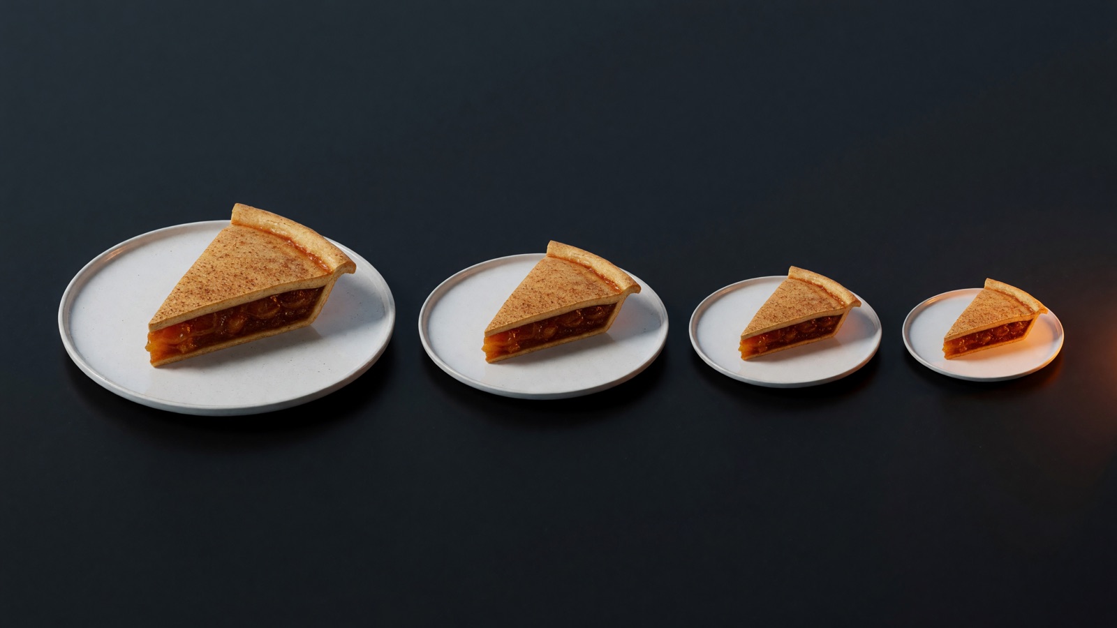
    The same pie slice on a series of plates that shrink from left to right
    Same 55%. The pie it is cut from has been redefined four times since 2020.

    The contractual long-form advertising split has been 55% creator, 45% YouTube since it was standardised in 2013. Google’s own business-model document states it; YouTube reaffirmed it in February 2025. Every credible attempt to back out the effective payout share from YouTube’s rolling disclosures (“over $30bn in three years”, “over $70bn”, “over $100bn in four years”) lands in a 51% to 64% band around 55%, with no downward trend that survives the estimation error.

    Across the whole decade there are exactly two places the share itself got worse, and both are narrow. Since November 2020, YouTube can run ads on videos from channels below the Partner threshold at a 0% creator share. And music licensing comes out of the Shorts pool before the creator’s 45% is applied. Neither comes close to explaining a decline of this size.

    What did get rewritten, repeatedly, is the base the percentage applies to. Shorts pay 45% of a pool that has already had music deducted. From February 2027, YouTube Premium will pay creators from a pool equal to 30% of net subscription revenue, split 55/45 by format, which works out to roughly 16.5 cents of a long-form Premium dollar. Shopping affiliate is a split of a merchant commission whose median is 15%. Sub-threshold inventory pays zero. Four new bases in six years, each with a less favourable formula than the original, each announced rather than negotiated. The headline percentage survives every one of them, which is precisely why it survives.

    Four things moved under the share. You control almost none of them.

    1. Format mix

    Shorts went from 30 billion daily views in 2022 to 200 billion in 2026. They now supply 61% of measured YouTube views (Metricool, 800,000 videos, 71,000 accounts) at 3% to 14% of the long-form rate. AIR Media-Tech’s 2026 data across 300 channels puts median long-form RPM near $2.30 and US Shorts RPM at $0.33; you need 11,000 to 34,000 Shorts views to match 1,000 long-form views. Blend a very-high-view, very-low-rate surface into your average and per-view income falls while long-form rates stand still.

    The substitution is real, too. A study of 250 channels with 100,000+ subscribers found long-form views fell by a mean of about 740,000 per channel after the channel’s first Short. The average length of YouTube’s most popular videos compressed from around 35 to 28 minutes, and algorithm-suggested video length halved from 80 to 40 minutes. Ad breaks scale with duration; shorter videos carry fewer of them. The feed decided which format grows and what it pays. Your lever: which format you feed it.

    2. Ad prices

    Alphabet’s own filings show cost-per-click falling every year from 2015 to 2020. On the buy side, YouTube CPMs fell 16% to 23% in three of the last four fourth quarters. The Q4 2025 figures are unusually clear: YouTube ad impressions grew 38% while advertiser spend on YouTube grew 13%. Arithmetically that is an 18% CPM decline. A publisher put it plainly back in 2020: “We’re creating inventory faster than they can fill it.”

    On a channel it looks like this. Across the same panel of creators, average views per post rose from 3,405 to 5,985 between February 2025 and February 2026, while monetised playbacks per post fell from 576 to 238. More attention, fewer paid events per unit of attention. Your lever on the auction clearing price: none.

    3. Inflation

    US CPI-U rose 39.1% from the 2016 annual average to July 2026. A creator whose nominal RPM never moved lost 28% of purchasing power per thousand views without a single policy changing. Long-form nominal rates are roughly flat across the decade, and flat is a cut. Nobody indexes a revenue share to CPI. Your lever: none.

    4. Supply

    Uploads went from 300 hours a minute in 2014 to over 20 million videos a day in 2026. Goldman Sachs counts roughly 50 million creators globally, growing 10% to 20% a year, with the professional share stuck near 4%. A steady professional share inside a growing population means more professionals exist and the odds of becoming one stay flat. Survey data agrees: 56.55% of full-time creators now earn below a living wage, up from 48% in the previous wave (NeoReach, 3,000+ creators). Your lever on how many people upload tomorrow: none.

    Meanwhile, the platform’s side of the ledger

    The platform earns on volume. You earn on price per view. Only one of those went up.

    Two conveyor belts: one overflowing with glowing play-button tokens, one carrying a single coin, with a scale tipping to the volume side
    Impressions grew 38% in Q4 2025. Advertiser spend grew 13%. The auction did the rest.

    YouTube advertising revenue went from $11.2bn in 2018 to $40.4bn in 2025, and total YouTube revenue including subscriptions passed $60bn. Using viewers as the denominator, because that is the one quantity both sides actually report, platform ad revenue per viewer rose about 2.6× between 2018 and 2026 on the best available estimates (the 2018 endpoint is reported; the 2026 endpoint uses a viewer forecast and an estimated ad revenue figure). Indexed to 2018:

    Series 2018 2026 Change
    YouTube advertising revenue 100 403 +303%
    Platform ad revenue per viewer 100 262 +162%
    Creator long-form RPM, nominal 100 115 +15%
    Creator long-form RPM, real 2016 $ 100 86 −14%
    Creator blended RPM incl. Shorts, real 2016 $ 100 37 −63%
    Platform and creator earnings per unit of attention, indexed to 2018. Creator series use a central RPM path built from disclosed creator data; see methodology note.

    Nobody at YouTube had to decide to pay creators less. Revenue sharing on auction-priced, supply-elastic inventory does it on its own: the platform’s revenue grows with impression volume, the creator’s revenue depends on price per impression, and volume has outrun demand every year. All of the price risk sits with the creator, all of the volume gain sits with the platform, and the contract reads the same on both days. A creator who owned any part of the terms would have priced that risk. A creator who rents the terms absorbs it.

    The best landlord in the market is still a landlord

    Movers wheel away the glass walls of a creator's studio while a small circle of people stays around the desk, lit warm
    The walls belong to the platform. The people around the desk don’t.

    YouTube publishes more than anyone else, and by a distance. Meta paid creators “nearly $3 billion” in 2025 against $196bn of ad revenue, about 1.5%. TikTok has never published a percentage for organic content. Meta ended three named revenue-share products on a single day in August 2025 and moved to flat guarantees. X launched revenue sharing in 2023, pivoted it twice, and closed it on 7 August 2026 with about a month’s notice. Of the four large ad-funded platforms, only Twitch publishes an explicit contractual creator percentage today.

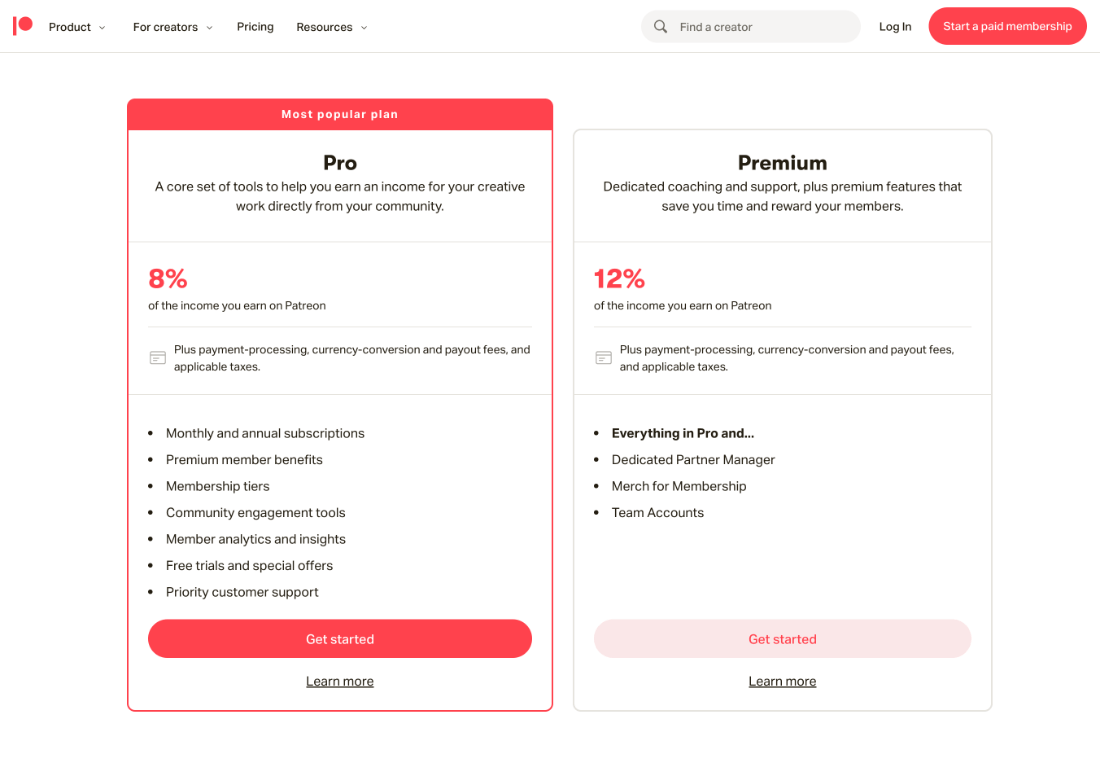
    Off the ad platforms: Patreon’s standard fee is 10% for pages created since August 2025 (the 8% tier is grandfathered), Substack is 10%, Ko-fi is 0% to 5%.

    The lesson is smaller than “stay on YouTube” and larger than “leave it.” No ad platform prices your relationship with the people who watch you. They price impressions, and they reserve the right to reprice them, redefine them, or stop paying for them, on their calendar. A published 55% beats an unpublished formula every day of the week. It still describes a rental agreement.

    Stop optimising a deal you don’t control

    These follow from the mechanisms, not from drawing a trend line into the future.

    The revenue lines growing fastest sit outside the auction. Over half of Partner Program channels earning five figures or more in 2024 earned from non-ad sources. Sponsored videos grew 54% year on year in the first half of 2025, led by creators averaging 100k to 500k views. Direct fan payments, affiliate and brand deals never pass through the CPM mechanism. They price the relationship, and the relationship is the one number in this article that didn’t shrink.

    Treat per-view ad income as structurally declining. More supply, cheaper-to-make short content, inventory outgrowing demand: each of these feeds the others. Views up 76% and monetised playbacks down 59% on the same channels is what that looks like on a dashboard.

    Watch-time depth is the defensible asset, not view count. Long-form carries the ad slots, the Premium skew, and the sponsorship inventory. In one dataset a 120-minute video earned on average 100× a 20-minute one. The algorithm has moved against length, so this is a positioning choice made against the platform’s distribution incentives.

    Price contractual clarity as a feature. Any income line that depends on an unpublished, revocable formula deserves a discount that a published 55% does not. Meta’s overnight shutdowns and X’s one-month notice show what “formula” means in practice.

    Watch access, not share. The last three years are unchanged percentages plus rising thresholds. Model eligibility risk at least as carefully as rate risk, because that is where the August 2026 changes actually landed.

    The one asset that isn’t denominated in views

    The report behind this article tests two hypotheses. The first, that platforms deliberately compressed creator value, fails on the evidence. The second, that creators went from scarce partners to abundant suppliers, holds for generic attention and fails for identifiable audiences: platforms are visibly bidding for named talent, and mid-tier sponsorship demand is growing fastest. The market split in two. Undifferentiated views became a commodity priced by an auction you don’t attend. A group of people who chose you, and would find you again if the feed forgot you tomorrow, became more valuable, and it sits outside every table above.

    Most creators already own that second thing. Very few hold it on terms they set. The ad share can’t be renegotiated by you, the format mix can’t be voted on, and the eligibility bar moves when the platform says it moves. Asking the people who chose you, directly, once, on terms you publish and keep, is the only version of this business where the contract stops changing underneath you.

    Put the whole decade in one line: attention you rent is getting cheaper. Relationships you own are getting more valuable.

    So the practical conclusion is narrower than “leave” and bigger than “diversify.” YouTube is an extraordinary distribution machine, and by the numbers above it is the most generous one in the market. Use it for distribution. Then treat the relationship that distribution creates as an asset you control, with terms you wrote, on a page you can’t be evicted from. Distribution and ownership are two different things, and the last ten years are what happens when creators run their whole business on the first one.

    That second thing is what we build. Base.Tube’s Content Pass lets your fans buy access once and keep it, and pays you 90% at the moment of purchase, on terms that are written down and don’t move. It sits alongside your channel; the channel keeps doing the distribution. If the numbers in this piece describe yours, that is the part of the business worth owning first.


    Methodology note

    YouTube has never published RPM or CPM data, and the RPM metric itself only appeared in YouTube Studio in July 2020, so no primary per-view series exists. Revenue-share terms, thresholds, Alphabet financials and CPI are primary sources. Creator per-view figures are drawn from disclosed creator data (Business Insider creator interviews 2020 and 2022, AIR Media-Tech’s 300-channel 2026 study, Metricool’s 2026 format study, r/PartneredYoutube retrospectives). The “central RPM path” used for the 44M/141M and indexed figures is a midpoint of the documented range for each year ($2.25 in 2016, $2.00 in 2018, $2.60 in 2020, $3.50 in 2022, $2.80 in 2024, $2.30 in 2026) and is an assumption made to permit the arithmetic; the conclusions about direction and mechanism rest on reported data and are considerably more robust than any point estimate. Full source list on request.

    Sources (selected)

  • Holiday Membership Showdown: Patreon vs Ko-fi in 2026

    Holiday Membership Showdown: Patreon vs Ko-fi in 2026

    Holiday Membership Showdown: Patreon vs Ko-fi in 2025

    Last holiday season I had one mission: capitalize on the mid-November to early January engagement spike instead of waiting for ad revenue to sag in January. I ran identical “holiday club” campaigns on Patreon and Ko-fi over 90 days (November 15 to February 15, 2024–2025) to answer a simple question: which platform truly delivers for a mid-sized creator?

    Key Takeaways

    • Ko-fi delivered about 12–18% more net income in that 90-day window, largely thanks to lower platform cuts and instant payouts.
    • Patreon memberships felt stickier, with ~88–90% of patrons retained into February vs. ~80–82% on Ko-fi.
    • Use Ko-fi as a fast “seasonal tip jar + bundles” engine; use Patreon for an ongoing fan club with robust community tools.
    • Setup time: ~45 minutes on Ko-fi (with Gold plan), ~90+ minutes on Patreon Pro—Patreon assumes long-term builds, Ko-fi loves spur-of-the-moment sprints.
    • My 2025 playbook: Hybridize—Ko-fi for quick holiday cash and one-offs, Patreon for sustained membership value.

    Experiment Setup

    I’m a full-time creator in the “creator tools” space (YouTube deep dives, Notion templates, etc.). My audience as of late 2024:

    • ~45,000 YouTube subscribers
    • ~9,000 email newsletter subscribers
    • Active on X (Twitter) and Instagram

    The holiday offer was identical on both platforms:

    • $5 Cozy Supporter: Digital advent calendar with daily prompts & templates, access to a private holiday feed.
    • $15 Holiday Workshop: Everything above plus three live planning sessions (year-end wrap up, New Year goal setting, Q1 content sprint).

    On Ko-fi, I added a pay-what-you-want “Holiday Tip Jar” and a $12 one-off bundle in the shop. On Patreon, I stuck to tiers and used “Commerce” for any extra digital sales.

    Links were split 50/50 across YouTube descriptions and newsletter CTAs with unique UTM tags—close enough to real-world A/B testing.

    First Impressions: Speed vs. Control

    Ko-fi felt like launching a pop-up shop: clean interface, no monetization wizard, instant publishing. With Ko-fi Gold at about $6/month (as of 2024–2025), I paid zero platform fees on memberships and shop items—just the standard ~2.9% + $0.30 processing. I had tiers, a shop bundle, and a tip jar live in roughly 40 minutes, holiday playlist on in the background.

    Patreon felt like a CRM meets community hub. I spent about 90 minutes setting up tiers, benefits, post tags, Discord roles, and Commerce options. Patreon Pro’s 8% platform fee (plus 2.9% + $0.30 processing and a $0.10 payout fee) ensures you think “long-term membership” rather than “seasonal sprint.”

    Money Talk: Fees, Payouts, and Net Income

    This really hit home when holiday cash flow was critical for ad boosts and year-end expenses.

    • Ko-fi gross (memberships + tips + bundles): ≈ $16,200
    • Ko-fi net after payment processing and Ko-fi Gold: ≈ $15,400
    • Patreon gross (memberships only): ≈ $14,700
    • Patreon net after platform + processing fees: ≈ $13,000

    Net on Ko-fi was roughly 18% higher. And payouts landed instantly via PayPal/Stripe, letting me reinvest flash-sale revenue into ads the same day. Patreon stuck to a monthly payout cadence, which felt like driving with the handbrake half on during a seasonal sprint.

    Building Tiers, Bundles, and One-Offs

    I thrive on theming: “Cozy Supporter,” “Holiday Workshop,” even “Festive Goblin” if allowed. Ko-fi’s builder is basic but perfect for:

    • $5 Cozy Supporter tier
    • $15 Holiday Workshop tier
    • $12 one-off digital bundle in the shop
    • Pay-what-you-want tips

    Ko-fi effortlessly handled mixed one-offs and memberships—seasonal experiments shine here. Kickstarter vibes, but without looming deadlines.

    Patreon’s tier system is more powerful: posts, perks, Discord roles, limited-time add-ons layered on evergreen memberships. But its native model skews toward recurring payments. Commerce for standalone winter packs exists, yet fans still think “monthly support.”

    Community & Retention: Post-Holiday Pulse

    After New Year’s, retention shows platform DNA.

    • Ko-fi: Support-only posts, comments, basic messaging. February retention around 80–82%. Feels like an extended tip jar once holiday hype fades.
    • Patreon: Patron-only feed, polls, Discord channels that morph from “Holiday Lounge” to “Q1 Brainstorm.” February retention around 88–90%. Feels like a genuine club, not just a seasonal stop.

    Trade-off: Ko-fi nets more money up front and attracts casual supporters; Patreon nets fewer but higher-committed members who stick around.

    Tech & Integrations: Quality-of-Life Wins

    Ko-fi perks:

    • Stupid-simple embed widgets for live streams (0% platform fee on tips).
    • Instant payouts—plan flash sales and ad buys without delay.
    • Shop + memberships + tips in one dashboard.

    Patreon perks:

    • Advanced analytics (join dates, churn triggers, tier performance).
    • Polls and Discord integration for real-time community feedback.
    • Commerce for digital and physical products alongside monthly tiers.

    Conclusion & Next Steps

    My real-world 2024–2025 holiday test confirmed that no single platform wins every round. Ko-fi excels for swift holiday launches, one-off bundles, and low-commitment tips. Patreon shines for building an enduring micro-community that carries momentum beyond January.

    Next steps for your holiday membership plan:

    1. Decide on your primary goal: quick revenue boost or sustained community growth?
    2. Map out tier/perk names and deadlines—seasonal vs evergreen.
    3. Set up parallel tracking (UTM tags, platform analytics) to compare performance.
    4. Consider a hybrid approach: Ko-fi for flash offerings and tips, Patreon for ongoing membership tiers.
    5. Plan your post-holiday retention strategy—polls, exclusive content, Discord channels.

    Whether you’re a creator launching your first winter campaign or a seasoned pro, use these insights to craft a holiday membership playbook that fills your pocket and warms your community’s heart well into the new year.

  • YouTube Thumbnail CTR: What Makes People Click (+ Free Score Tool)

    YouTube Thumbnail CTR: What Makes People Click (+ Free Score Tool)

    Your video is getting impressions and almost no clicks. That’s not a content problem — it’s a packaging problem, and it’s fixable in an afternoon. This guide covers the two levers that decide whether anyone clicks: what makes a thumbnail earn the click in the first place, and how to A/B test titles and thumbnails so you stop guessing.

    Short on time? You can skip the theory: score any thumbnail free with the Base.Tube CTR Optimizer — upload it, get a 0–100 score plus the specific fixes, in about 30 seconds. No signup.

    What Is a Good CTR on YouTube?

    Click-through rate is the percentage of people who click your video after seeing the thumbnail in their feed. As a working benchmark:

    • Under 3% — your packaging is losing to the competition around it. Fix this before anything else.
    • 4–6% — typical for most niches. Fine, not growing you.
    • 8%+ — your thumbnail is winning attention; the algorithm responds by widening distribution.

    Context matters: CTR naturally drops as YouTube shows your video to colder audiences, so a falling CTR on a video getting more impressions can still be a win. Judge CTR alongside impressions and average view duration, never alone.

    Why CTR Is the Highest-Leverage Number You Control

    Every recommendation system works the same way: if people see your video and don’t click, the platform quietly stops showing it. Your thumbnail and title are the only part of your work that everyone sees — including the 95%+ who never watch a second. A one-point CTR improvement doesn’t add views linearly; it changes how widely the algorithm distributes you, which is why small packaging fixes routinely out-earn hours of editing polish.

    The 7 Things That Actually Make People Click

    Across thumbnail scoring at scale, the same factors separate clicked thumbnails from ignored ones:

    1. One readable focal point. A thumbnail is seen at postage-stamp size on a phone. One face, one object, or one number — not a collage.
    2. Three words or fewer of text. Text that can’t be read at small size is visual noise. If the text repeats the title, delete it.
    3. Contrast against YouTube’s UI. White backgrounds disappear into the page; dark mode swallows dark thumbnails. Strong subject/background separation wins in both.
    4. A face with a real expression. Genuine emotion outperforms the exaggerated shocked-face cliché in most niches — viewers have learned to skip the pantomime.
    5. Curiosity gap, honestly earned. The thumbnail poses the question; the video must answer it. Clickbait spikes CTR and then kills you on watch time.
    6. Visual consistency across your channel. Returning viewers click faster when they recognize your look. A repeatable style is a compounding asset.
    7. Title and thumbnail that complete each other. The strongest packages split the work: thumbnail carries the emotion, title carries the specifics. If they say the same thing, one of them is wasted.

    Not sure which of these your thumbnail fails? Run it through the free CTR Optimizer — it grades each factor and tells you the one change that matters most. And if the verdict is “start over,” the AI Thumbnail Generator builds alternatives from your video’s topic in a minute.

    How to A/B Test Titles and Thumbnails (the Right Way)

    Scoring gets you a strong candidate. Testing proves it with your actual audience. The system:

    1. Pick the right videos to test

    In YouTube Studio, sort recent uploads by impressions and find the ones with healthy impressions but CTR under ~5%. Those are your high-leverage targets — the algorithm is already willing to show them; viewers are declining the offer.

    2. Test hypotheses, not cosmetics

    Changing one adjective teaches you nothing. Test genuinely different concepts: face vs. no face, outcome-promise title vs. pain-avoidance title, big number vs. no number, minimal vs. bold text. Each variant should represent an idea about what your audience responds to — that way even a losing test produces knowledge.

    3. Use YouTube’s built-in Experiments

    YouTube Studio’s “Test & compare” feature splits impressions across up to three thumbnails and reports which earned the most watch share — not just clicks, which protects you from crowning clickbait. Where it isn’t available, rotate variants manually every 24–48 hours and log results, changing nothing else during the window.

    4. Let it run to significance

    Aim for 1,000+ impressions per variant, typically 3–7 days. Calling a winner after 12 hours is how you institutionalize noise. If variants land within a few tenths of a percent of each other, the difference isn’t real — next round, test bigger swings.

    5. Judge on CTR and retention

    A variant that lifts clicks but tanks average view duration made a promise the video doesn’t keep. Keep the hook structure, fix the wording — or fix the intro so the video pays off the promise faster.

    6. Log the pattern, not just the winner

    The compounding value of testing is the pattern library: “big numbers beat vague promises for us,” “clean background beats gameplay clutter.” After 10–15 tests you’ll have a personal playbook that makes every future thumbnail start from a proven baseline — and gives you sharper hypotheses to score before you ever publish.

    The Bigger Picture: CTR Is the Lever You Own

    You don’t control the algorithm, the ad rates, or the policy changes — platforms decide those, and creators live with the consequences. Your packaging is different: it’s one of the few levers entirely in your hands, and it’s the cheapest one to improve. That’s why we built the CTR Optimizer and Thumbnail Generator free: Base.Tube exists to give creators more ownership over their reach and their income, and click-through is where that starts.

    FAQ

    What is the average CTR on YouTube?

    Most videos land between 2% and 10%, with 4–6% typical for established channels. New-to-you audiences (Browse and Suggested traffic) click less than subscribers, so compare CTR within the same traffic source, not across channels.

    Can I change a thumbnail after publishing?

    Yes, at any time, with no penalty. Updating thumbnails on older videos that still earn impressions is one of the fastest free wins on YouTube — the algorithm re-evaluates the new package against live traffic.

    How many thumbnails can I test at once on YouTube?

    YouTube’s Test & compare supports up to three thumbnails per video and declares a winner based on watch-time share. For title tests, rotate manually or re-package older videos.

    How do I know if my thumbnail is good before publishing?

    Score it before you upload: the free Base.Tube CTR Optimizer evaluates readability, contrast, focal clarity, text load, and emotional pull, and returns a 0–100 score with the specific fixes — so your A/B test starts from two strong candidates instead of two guesses.

  • Q4 ’25 Holiday Content Earnings: YouTube, TikTok & Instagram

    Q4 ’25 Holiday Content Earnings: YouTube, TikTok & Instagram

    Every November I morph into a spreadsheet-wielding, coffee-fueled lab rat—three phones on deck, all eyes on Q4 revenue. In 2025 I ran a controlled experiment across YouTube, TikTok, and Instagram, using the same niche (tech gear and creator tools) and identical content themes (gift guides, “best under $50” lists, upgrade rundowns). Here’s exactly what landed in my bank account—and which platform I’d back if holiday posts had to pay my rent.

    FTC Disclosure: This article contains affiliate links. I earn commissions on qualifying purchases. Some posts include sponsored content and brand partnerships; all compensation is disclosed per deal.

    Methodology

    • Timeframe: Nov 20–Dec 31, 2025; earnings recorded in USD.
    • Revenue types: ad RPMs, memberships, live gifts, subscriptions, affiliate commissions, brand deal fees.
    • Net vs. gross: all figures shown are net of platform cuts (YouTube ads 45% cut, TikTok live gifts ~50% cut, Instagram subs/Reels ~30% cut).
    • Affiliate tracking: commissions logged via retailer dashboards; payouts confirmed after return windows closed (by Jan 15, 2026).
    • Brand deals: fees recorded on receipt of payment, net of any agency or management commissions.

    Summary of Net Earnings (Nov 20–Dec 31, 2025)

    • YouTube (ads + memberships + live): ~$3,110 from featured video & one Q&A live (long-form & Shorts contributed beyond that).
    • TikTok (Creator Rewards $1,600 + Live Gifts $3,400 + small brand deals $800): $5,800 total.
    • Instagram (Reels bonuses ~$200 + Subscriptions $1,450 + Affiliate sales $11,000): $12,650 total.

    YouTube: The Q4 Workhorse

    Mid-November RPMs began climbing quietly, then spiked after Black Friday. During the experiment my long-form RPM sat between $3.20–$7.50 per 1,000 views, peaking at $8.10 in a finance-adjacent video. One “10 Creator Gadgets Under $50” guide (dropped pre-Cyber Monday) generated:

    • ~310,000 views
    • Avg. $6.60 RPM (≈$2,000 ad revenue)
    • +96 new members at $4.99/mo (≈$330 net)

    A 90-minute live on Dec 22 brought in another $780 via Super Chats/Super Thanks. By month’s end YouTube comprised roughly 70% of my creator income, thanks to predictable ad payouts, memberships, and occasional live bumps—though each 12–15-minute upload still cost 10–20 hours of work.

    TikTok: Live-Driven Lightning Strikes

    TikTok’s Creator Rewards hovered around $0.40–$0.80 RPM for 60+-second clips. One 1.8M-view video earned ~$1,000. But the real jackpot was live shopping:

    • Dec 19 “Last-Minute Amazon Setup Upgrades” Live (90 min): ~$2,300 net in gifts
    • Smaller Christmas Live (45 min): ~$800 net

    Overall TikTok delivered $5,800: $1,600 in rewards, $3,400 from live gifts, $800 via brand slots. Feels like gambling—unpredictable feed money vs. very lucrative live sessions.

    Instagram: Commerce Over Views

    Reels payouts were negligible (~$200 for 5.8M views). But subscriptions and shoppable content changed the game:

    • Subscriptions: grew from ~260 to ~430 at $4.99/mo, netting ~$1,450.
    • Affiliate sales via link stickers and product tags: ~$11,000 in commissions.

    Instagram itself paid the least per view, but as a shopping funnel it quietly out-earned platform bonuses. It’s less “ad revenue” and more “digital storefront.”

    Key Takeaways

    • YouTube = steady, math-friendly backbone (ads + memberships + live features).
    • TikTok Lives = high-variance but potent holiday gift spikes.
    • Instagram = low direct payouts, powerhouse affiliate and subscription engine.

    If you want predictable Q4 cash, build your foundation on YouTube long-form, layer on TikTok Lives for burst income, and use Instagram as your commerce playground.

  • The 10 Best Episodic Content Tools for Creators in 2026

    The 10 Best Episodic Content Tools for Creators in 2026

    This round-up caught my attention because episodic content stopped being a niche strategy years ago — it’s now the easiest way to keep audiences coming back and please recommendation algorithms. I follow creators who went from random posts to multi-episode franchises, and the tool choices they make determine whether a series feels polished or falls apart in episode three. So I pulled together the tools creators are actually using in 2025 and tested the headlines: which features are meaningful, which are marketing, and what you should pick based on team, budget and platform.

    The 10 Best Episodic Content Tools for Creators in 2025 — what to actually use

    What Makes Episodic Content Different from One-Offs?

    Before the tools, it is worth spelling out why episodic production needs a different toolkit from standalone videos. Three things change when you commit to a series.

    First, arc tracking. A series has narrative threads that span multiple episodes — character arcs, recurring segments, callback references. Without a system to log these, continuity slips through the cracks by episode four. Spreadsheets can do it, but purpose-built tools surface conflicts and gaps faster.

    Second, visual and audio consistency. Audiences notice when your color grade drifts or your lower-thirds use a different font between episodes. Maintaining a consistent look across weeks of production requires templates, presets and sync tools that one-off projects never need.

    Third, batch workflows and scheduling. Episodic creators shoot, edit and publish on a repeating cadence. That means recurring shoot schedules, batch exports, repeatable project structures, and a content calendar that accounts for dependencies between episodes. Tools built for series reduce that friction to near zero.

    These three factors — arc tracking, consistency, batch workflows — are the lens I used to evaluate the tools below.

    Below: a numbered Top 10 with one-line summaries. Read on for feature calls, pricing tiers, a simple decision matrix, and recommended combos by creator profile.

    1. Final Draft — Industry screenwriting with episodic trackers and AI-assisted scene suggestions for long-form arc management. Its strength is structured, dialogue-heavy series where character continuity matters across episodes. The limitation: expensive for what is essentially a writing tool, and collaboration features lag behind cloud-native alternatives. Best for scripted content that tracks recurring characters and plot threads across a full season. (Pricing tier: $$; Platforms: macOS, Windows, iOS, Web)
    2. Celtx Studio — All-in-one pre-production + season planning with built-in episodic trackers and production exports. Celtx covers writing, scheduling and budgeting in one interface — useful for small teams avoiding five separate apps. The tradeoff is depth: its script editor is competent but less refined than Final Draft, and its scheduling module is lighter than StudioBinder’s. Where it shines is the season-level planner that tags scenes across episodes and exports beat sheets directly into production. (Pricing tier: $–$$; Platforms: Web, macOS, Windows, iOS, Android)
    3. StudioBinder — Production management that handles episode-level shooting schedules, call sheets and two-way calendar sync. The operational backbone for teams shooting on location across multiple episodes. Its free tier is surprisingly capable for a single production, but episodic features — recurring cast availability and cross-episode location scheduling — require paid plans. One limitation: web-first, so offline access is limited during field shoots. (Pricing tier: $–$$$; Platforms: Web, iOS)
    4. Storyboard That — Fast visual storyboarding for episode blocking and shot-lists; useful for remote teams and quick iterations. (Pricing tier: $; Platforms: Web)
    5. Adobe Premiere Pro — Editing with batch clip-trim tools and episode-sync presets for consistent cuts across episodes. (Pricing tier: $$; Platforms: macOS, Windows)
    6. DaVinci Resolve — Color, finishing and “Episode Sync” workflows that copy grades, LUTs and timeline settings across episode timelines. The free version is the most capable no-cost editor for series work — multi-timeline projects, Fairlight audio, and solid color grading at zero cost. The Studio upgrade unlocks GPU noise reduction, HDR grading and collaborative workflows for larger teams. Steeper learning curve than Premiere, but the payoff for episodic consistency is significant. (Pricing tier: Free–$$$; Platforms: macOS, Windows, Linux)
    7. After Effects — Motion templates and episode templates to keep title and lower-third design consistent across a series. (Pricing tier: $$; Platforms: macOS, Windows)
    8. Descript — Transcripts, multitrack rough-cuts and Overdub that speed up episodic editing and repurposing. Descript is the fastest path from footage to rough assembly for talk-based series — podcasts, interviews, commentary. Edit the transcript and the video follows. For episodic work, saving speaker profiles and templates across projects means episode two takes half the setup time of episode one. The limitation: Descript is optimized for dialogue, not visual storytelling. B-roll heavy series with minimal narration will hit its ceiling fast. (Pricing tier: Free–$; Platforms: Web, macOS, Windows, iOS)
    9. CapCut — Mobile-first repurposing and batch export to vertical formats with basic scene-aware trims for social episodes. (Pricing tier: Free–$; Platforms: iOS, Android, Web)
    10. Canva — Social templates, bulk-resize and scheduler that turn episodes into platform-ready assets fast. (Pricing tier: Free–$; Platforms: Web, macOS, Windows, iOS, Android)

    Why these 10 matter — and what to watch for

    You’ll see a pattern: pre-production tools focus on season arcs and episode trackers (Final Draft, Celtx), production managers keep logistics tight (StudioBinder), post tools solve consistency at scale (Premiere, DaVinci, After Effects), and social tools close the loop (Descript, CapCut, Canva). The tradeoff is always best-of-breed vs. consolidated suites. For solo creators, integrated suites reduce friction; for larger teams, advanced post features and robust integrations win productivity back.

    Concrete episodic features and examples

    • Episode / Arc trackers: Final Draft (2024/13 update) added scene-assist features that suggest alternate beats for recurring characters — useful for mapping arcs across episodes. Celtx’s season planner lets you tag scenes and export episode-level beat sheets to production.
    • Episode Sync (post): DaVinci Resolve supports copying color grades, LUTs and timeline presets across multiple episode timelines so every ep keeps the same look without repeating tweaks. Premiere’s project templates and batch export features speed up iterative cuts.
    • Two-way integrations: StudioBinder and Final Draft integrations reduce manual exports: scripts -> shooting schedule -> call sheets can now flow without rekeying, saving hours per episode on average in small productions.
    • AI that helps, not replaces: Descript transcribes and marks speaker changes to speed up rough cuts; Premiere/DaVinci’s AI trims and scene-detection speed repetitive tasks. These are pattern-match assistants — still require human oversight for tone and story.

    Free vs Paid: Where to Draw the Line

    Most tools on this list offer a free tier or trial. When do you actually need to pay? After testing free versions against episodic workflows, the answer comes down to two factors: episode volume and team size.

    For a solo creator producing fewer than four episodes per month, free tiers cover surprising ground. DaVinci Resolve free handles editing, color and audio. Canva free provides enough templates for thumbnails and social assets. CapCut is free for most features. You can run a lean episodic workflow without spending a dollar.

    The cracks appear when volume or collaboration increases. Free tools cap storage, export quality, or team seats. Descript’s free transcription hours run out fast if episodes exceed twenty minutes. Canva free lacks Brand Kit, meaning you manually match colors and fonts each episode instead of locking them once. StudioBinder’s free plan supports a single project — fine for one series, limiting if you run multiple shows.

    The paid features that deliver the clearest ROI for episodic creators are: batch export (saves hours per episode), brand/template locking (prevents visual drift), and multi-user permissions (avoids version conflicts). If your series hits five or more episodes and involves anyone besides you, paid tiers typically pay for themselves within the first month.

    Pricing & platform cheat-sheet

    Below I use price buckets rather than exact dollar figures to keep this useful across frequent vendor changes: Free, $ (≤ $15/mo per seat), $$ ($15–$50/mo), $$$ ($50+/mo or enterprise). Platform column lists where the apps run natively or in-browser.

    Tool Pricing Tier Platforms Standout Episodic Feature
    Final Draft $$ macOS, Windows, iOS, Web Scene/arc tracking + AI scene suggestions
    Celtx Studio $–$$ Web, macOS, Windows, iOS, Android Season planner + script → production export
    StudioBinder $–$$$ Web, iOS Episode-level scheduling & two-way calendar sync
    Storyboard That $ Web Fast visual storyboards and shot lists
    Adobe Premiere Pro $$ macOS, Windows Batch trims, project presets & episode templates
    DaVinci Resolve Free–$$$ macOS, Windows, Linux Episode Sync: copy grades/LUTs across timelines
    After Effects $$ macOS, Windows Motion/episode templates for consistent graphics
    Descript Free–$ Web, macOS, Windows, iOS Transcripts, Overdub, multitrack rough-cuts
    CapCut Free–$ iOS, Android, Web Batch export & vertical-first repurposing
    Canva Free–$ Web, macOS, Windows, iOS, Android Bulk-resize templates + scheduler

    Quick decision matrix: which tool if you…

    Profile Budget Quick pick
    Solo creator / vlogger Low Descript + CapCut + Canva (integrated, low-cost)
    Duo / small team Moderate Celtx + Premiere + Descript
    Mid-size indie show Moderate–High Final Draft + StudioBinder + DaVinci Resolve
    Studio / high-output High Final Draft + StudioBinder + Premiere/After Effects + centralized asset storage

    Recommended combos by creator profile

    • Solo / Duo (fast turnaround): Descript (scripted repurpose + rough-cuts) → CapCut (vertical exports) → Canva (thumbnails & posts).
    • Small team (season planning): Celtx (season tracker) → Premiere Pro (editing) → Descript (transcripts & cutdowns).
    • Indie series / mid-size (polish): Final Draft (arc tracking) → StudioBinder (scheduling) → DaVinci Resolve (color & Episode Sync) → After Effects (motion templates).
    • High-output studio: Final Draft + StudioBinder with asset management (cloud) + Premiere/After Effects + dedicated social repurpose pipeline (Descript, CapCut, Canva).

    Workflow Example: Planning a 6-Episode YouTube Series

    Here is a concrete walkthrough of how the recommended solo creator stack — Descript, CapCut and Canva — handles a six-episode YouTube series from planning through publication.

    Week 1: Planning and scripting. Outline all six episodes in a single document — a Google Doc or Notion page works fine. Define the through-line: what connects episode one to six, what recurring segments exist, and what the visual identity looks like (intro style, color palette, thumbnail template). Lock these decisions before recording. Changing your intro format at episode four looks sloppy and costs time.

    Week 2-3: Recording and rough assembly. Record in batches — two or three episodes per session. Import footage into Descript, which transcribes automatically. Edit by reading the transcript: cut filler, rearrange sections, mark highlights for social clips. Save speaker labels and your project template after episode one so subsequent episodes inherit the same structure. By episode three, per-episode editing time drops roughly 30-40% because the tool already knows your speakers and settings.

    Week 3-4: Social repurposing and packaging. Export final cuts from Descript, bring highlight clips into CapCut for vertical reformatting — batch export handles aspect ratio conversion and auto-captioning for Shorts, Reels and TikTok. In Canva, build your thumbnail template: same layout, font, color scheme, with a swappable image and episode number. Duplicate five times, swap visuals, six consistent thumbnails in under twenty minutes. Use Canva’s scheduler to queue social posts alongside each publish date.

    The result: Six episodes, visually consistent, social assets ready, using three tools costing between zero and fifteen dollars per month combined. No production management software needed at this scale.

    Buyer’s checklist — test these before you commit to an annual plan

    1. Integration test: can script/beat sheets flow into production schedules without manual copy/paste?
    2. Export formats: does the tool export to the formats your post team needs (AAF, XML, PDF, SRT)?
    3. Team permissions & version control: does it support per-episode versions and rollback?
    4. Storage & transfer: are assets centralized or do you need a separate DAM/CDN?
    5. AI transparency: can you see and edit AI suggestions (transcripts, scene suggestions, trims) before committing?
    6. Trial + templates: is there a free trial and episode templates to test at least two episodes end-to-end?
    7. Cost per seat vs. per-project: calculate real cost for your season (seats × months + storage + exports).

    How I tested these

    I built small pilot workflows for solo, duo and mid-size teams: wrote sample episode outlines, exported to production, ran a single shoot day schedule and pushed footage through edit, grading and social repurposing. I judged each tool on: episode consistency (did titles, lower-thirds, color match?), integration friction (how many manual exports?), and AI usefulness (time saved vs. required fixes).

    Frequently Asked Questions

    Can I use free tools for episodic content?
    Yes, up to a point. DaVinci Resolve free, CapCut and Canva free handle a solo series of four to six episodes per month without major friction. You will hit limits on transcription hours (Descript), brand kit features (Canva) and collaborative editing once you scale beyond that or add team members. Start free, upgrade only when a specific bottleneck forces the switch.

    What is the minimum tool stack for a series?
    At minimum, an editor and a template tool. Descript or DaVinci Resolve for editing, plus Canva for thumbnails and social assets, covers the essentials. Add a project management tool (even a free Notion board) once you pass three episodes or add a collaborator. Everything else is optimization.

    How do I keep visual consistency across episodes?
    Lock decisions early: color grade, fonts, intro/outro templates, thumbnail layout, lower-third style. Build these as presets in your tools before episode one. In DaVinci Resolve, save a PowerGrade and apply it across timelines. In Canva, create a Brand Kit (Pro) or a locked template (free). In Descript, save your project as a template with speaker labels and export settings. The principle: define the look once, replicate mechanically, resist the urge to “improve” mid-season.

    Final thoughts / TL;DR

    Pick for workflow fit, not hype. If you’re solo, favor integrated, low-cost stacks (Descript + CapCut + Canva). If you manage seasons and teams, invest in Final Draft or Celtx for arc tracking, StudioBinder for production, and Premiere/DaVinci for consistent post. Use AI to speed grunt work — not to write your beats. And before you subscribe, test two episodes end-to-end to reveal the hidden admin costs of stitching apps together.

    {{INFO_TABLE_START}}
    Publisher|Base.tube
    Release Date|2025-12-03
    Category|Episodic & Long-form Content tools
    Platform|Multi-platform (Web, macOS, Windows, iOS, Android)
    {{INFO_TABLE_END}}